.png)
System Designer
in a UX perspective
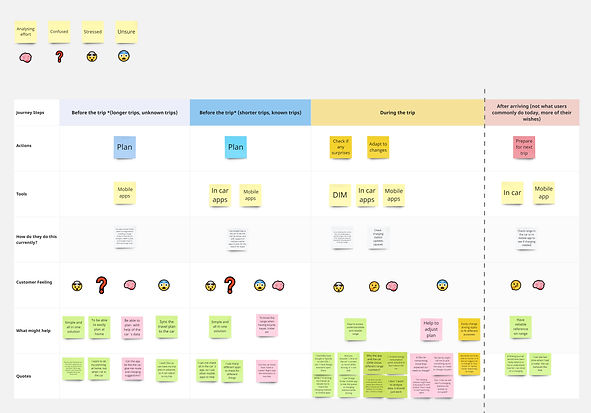
During my time at Volvo Cars, I was responsible for coaching the driver on how to understand and get the most out of their electric vehicle through the in-car screens and mobile app. This involved extensive competitor analysis, user studies for new/improved solutions, creation of low and high-fidelity prototypes, analysis of market trends and quality surveys, and the formulation of action plans for their implementation.
My role
The team's objective was to inform, educate, and coach users, both externally and within Volvo, on their electric car experience. In my role, I focused on creating entirely new features or enhancing existing ones to improve the user's electric car experience and reduce range anxiety. Some use cases are in detail below:
.webp)
Competitor Analysis

Tesla Model 3

Zeekr 001

Lynk & Co 01

Xpeng P7

Lucid Air
I consistently conducted competitor analysis, whether in the initial phase of a new project to understand market needs and trends, responding to a competitor launch directly correlated to our vehicles, or examining specific functions across different brands. One notable analysis focused on trip computers, where I thoroughly examined the UX and HMI implementation in all regional cars equipped with this feature, encompassing various scenarios like long drives and city traffic.
Quality Surveys
Regularly, Volvo Cars conducted quality surveys among recent car buyers, providing me with user feedback verbatims on UX and HMI. Analyzing these results, I delved into both commendations and complaints, comparing them with previous surveys. Using these insights, I developed action plans and presented compelling facts and numbers to motivate the company to proactively improve and elevate the overall user experience and satisfaction.


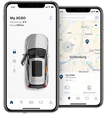
Range Assistant
A significant finding from quality surveys were user complaints about the absence of range (in km) on the center display (DIM). In response, a comprehensive action plan was implemented, leading to the creation of the "Range Assistant" app. Developed by my team and me for both Volvo Cars and Polestar, this app provided users with detailed insights into their range, including maximum and minimum range achievable with current battery energy, and how their driving style impacted consumption.
Range on DIM
Despite the introduction of Range Assistant, user complaints persisted in quality surveys about the range not being displayed on DIM. Consequently, a substantial internal action plan was initiated to address this issue, resulting in the over-the-air (OTA) introduction of the range number on the display for all electric vehicles at the beginning of 2023.


Consumption graph


.png)
Initially, Volvo chose not to include a historical consumption graph in its electric vehicles, while Polestar, Volvo's subsidiary, had incorporated it in their cars with a highly positive user response. In light of this, Volvo decided to adopt the feature in their vehicles as well. I played a pivotal role in this implementation, creating the initial proposals on Figma, aligning them with Volvo's System Design and brand identity.
Cold batery
Addressing the sensitivity of electric vehicle batteries to low temperatures, my team and I were tasked with informing users when temperature affected the vehicle and providing guidance. However, users were panicking unnecessarily when the message appeared, as no action was required. To alleviate this, we modified the trigger to display the message only when State of Charge (SoC) was low enough for temperature to become a genuine concern. Otherwise, the battery would naturally heat up during driving, resolving the issue without causing user concern.


Power meter

The power meter serves as a tool to indicate whether the car is drawing energy from the battery or recharging during braking. To enhance user comprehension of the vehicle's operations, my team and I integrated visual cues on the power meter to illustrate the car's actions and their impact on energy consumption. For instance, to encourage gentle braking and minimize wasted energy, a visual cue was added to convey the consequence of excessive brake pedal pressure.
Global Low Energy States
To address an overwhelming user experience during low battery situations in early electric Volvo models, where various functions triggered warnings at different thresholds and based on different metrics, I took the initiative to propose a streamlined approach. I suggested that all functions trigger warnings based on a common metric (range) and established fixed thresholds (100 km, 50 km, 20 km, and 0 km). This synchronized the warnings prevented that multiple alerts were triggered every few minutes and provided a more user-friendly experience during high-stress situations.
Limited
100 km
Critical
20 km
Low
50 km
Empty
0 km

3rd party app

Tesla's app

Battery health
Due to a new legislation, it would become mandatory to display the battery's health (how much it has degraded over time) in the car. To accomplish this, first I did some competitors analysis and found out that only Tesla had something similar to a battery health indicator, but in the mobile app. We also noticed that there was a lot of 3rd party apps that provided this as a payed service, so there was a user need for this functionality. So I came up with a first proposal of the design on Figma and this design was later tested on usertesting.com to prove its' comprehension.
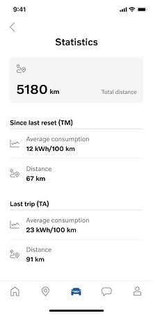
Trip computer: Consistency
The trip computer shown in the mobile app had a different structure and naming than what the user saw in the car. So, seeing that bad user experience, I created an action plan to have a consistency between app and in-car. That way, the user would have the same overall data and naming, creating less mental effort to absorve the information. For instance, the in-car solution has both trips and then all the data related to it, while in the app you had only te distance associated with the trips and remaining data was disconnected from which trip it was referring to. Also, the naming on the XC40/C40 platform was very confusing to the user (TM and TA), so replaced that with more user-friendly ones: "Since last reset" and "Last trip". This fix was applied to all Volvo's cars, including those in production and future projects.
In-car trip computer

App trip computer

ICEs
PHEVs
Production BEVs


User Journey

Trip computer: Current trip
The "Current Trip" (or Trip Auto) on the trip computer is reset automatically in some way of the other and the way it would be done for the next release was up for my team to decide. To make an informed decision, we began by examining how it was handled in existing Volvo cars on the market, to ensure familiarity for users. Next, we delved into competitor practices, searching for valuable insights. Subsequently, we meticulously mapped out use cases and user journeys, engaging in internal discussions to assess the feasibility of the proposed solution.
User study on range perception
A user research was made to to understand how Volvo's users perceived their electric car's range and its' functions. The research method was:
1. Screening
Select drivers with different charging possibilities, car usage and range function usage
2. Diary Study
Drivers record when and how do they think of range and use range functions during trips
3. 12 Semi-structured Interviews
Drivers talk freely about their trip. Probe on range and range function usage topics
_.jpg)
Results
After the research, the conclusion was that most users perceive range as complicated and that “Range in kilometer is still useful, then I know how far I can drive. The battery percent is just battery”. Then, a user journey was made on Miro to better understand the user's pain points.
User study on low battery

This user study was done with the goal of having a better understanding on their needs and behaviors when driving with a low battery.
Method:
6 moderated online interviews through usertesting.com with participants from UK, US, & Italy.
It was a 60 min semi-structured interview, where the participants would talk about their previous experiences
Results:
Driving with low battery is not intentional and a rare experience; what low battery means for each user is personal and what are the most common methods users do today to save battery. So we summarized the study with 3 recommendations:

